Using the Quantitation Summary to create reports and charts
An earlier article described how to create a Quantitation Summary in Mascot Daemon. This is a spreadsheet-like text file, where the rows correspond to proteins and the columns contain expression data for various samples in the form of abundances or ratios of abundances.
A Quantitation Summary can be opened and manipulated in a spreadsheet program such as Excel, and it is possible to create charts in general purpose software, although this can be hard work. A more efficient option is to use specialised software such as Perseus, from the Max Planck Institute. This is a good choice if you prefer to manipulate the data using a graphical user interface.
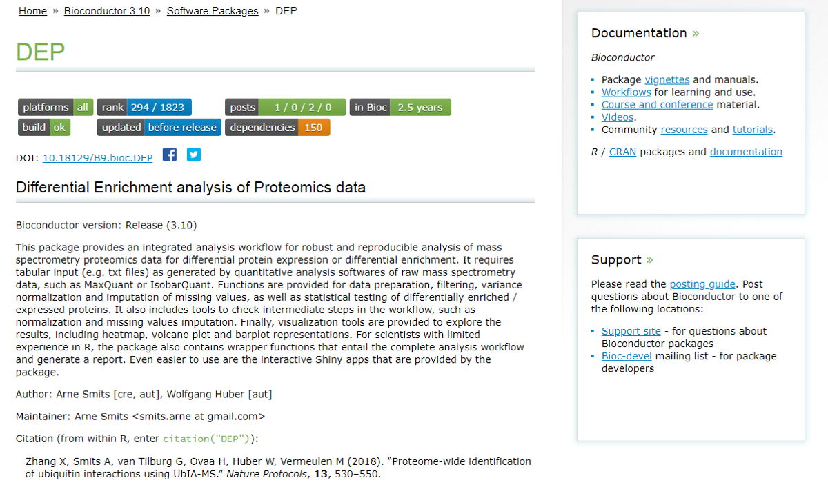
If you are willing to do a bit of scripting, the R language provides access to a huge range of statistical and graphical tools. Bioconductor is a collection of packages for genomic and proteomic applications. Currently, 135 packages are indexed under proteomics and 91 under mass spectrometry.
We’ll use a package called DEP (Differential Enrichment analysis of Proteomics data) to illustrate the types of analysis that can be achieved with a few lines of scripting.
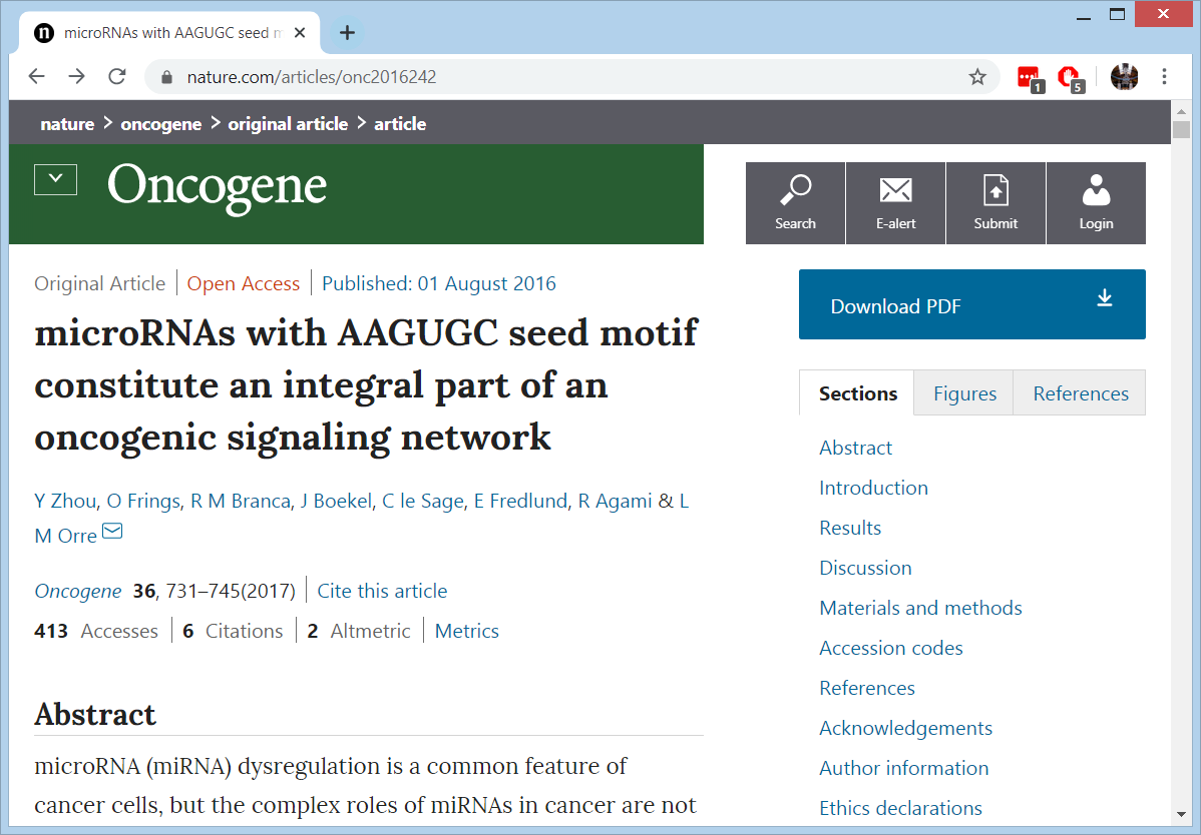
Sample data comes from a study to identify oncogenic microRNAs in non-small cell lung cancer.
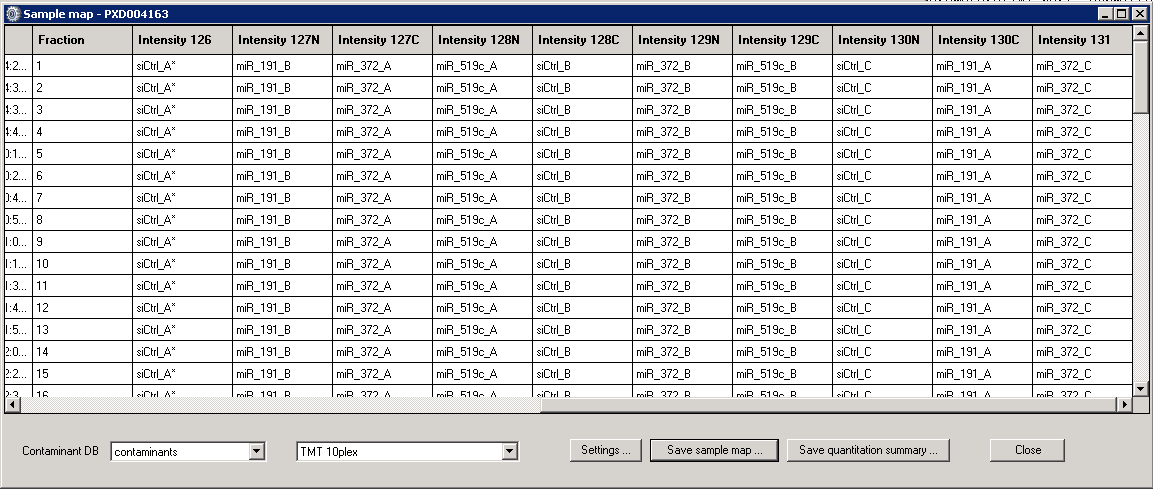
Quantitation used 10plex TMT. 72 files downloaded from PRIDE project PXD004163 were processed and searched using Mascot Daemon. The Sample Map in Mascot Daemon looked like this: 3 replicates of the control and one of the microRNA treatments, 2 replicates of the other two treatments. Peptide FDR was set to 1% by target/decoy.
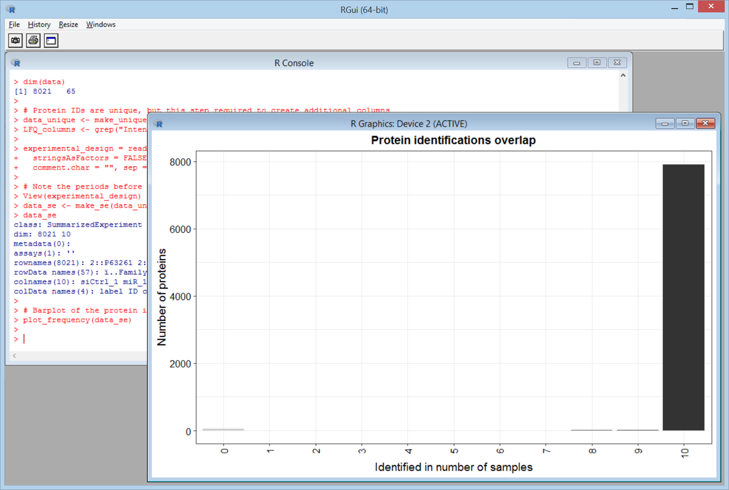
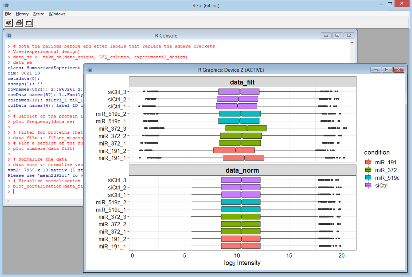
Using DEP, we can very easily create a number of informative charts. Some are for QC, such as this one, which shows we have data for almost all 8021 proteins across all 10 channels – very few missing values.
A box plot showing the intensities before and after normalisation.
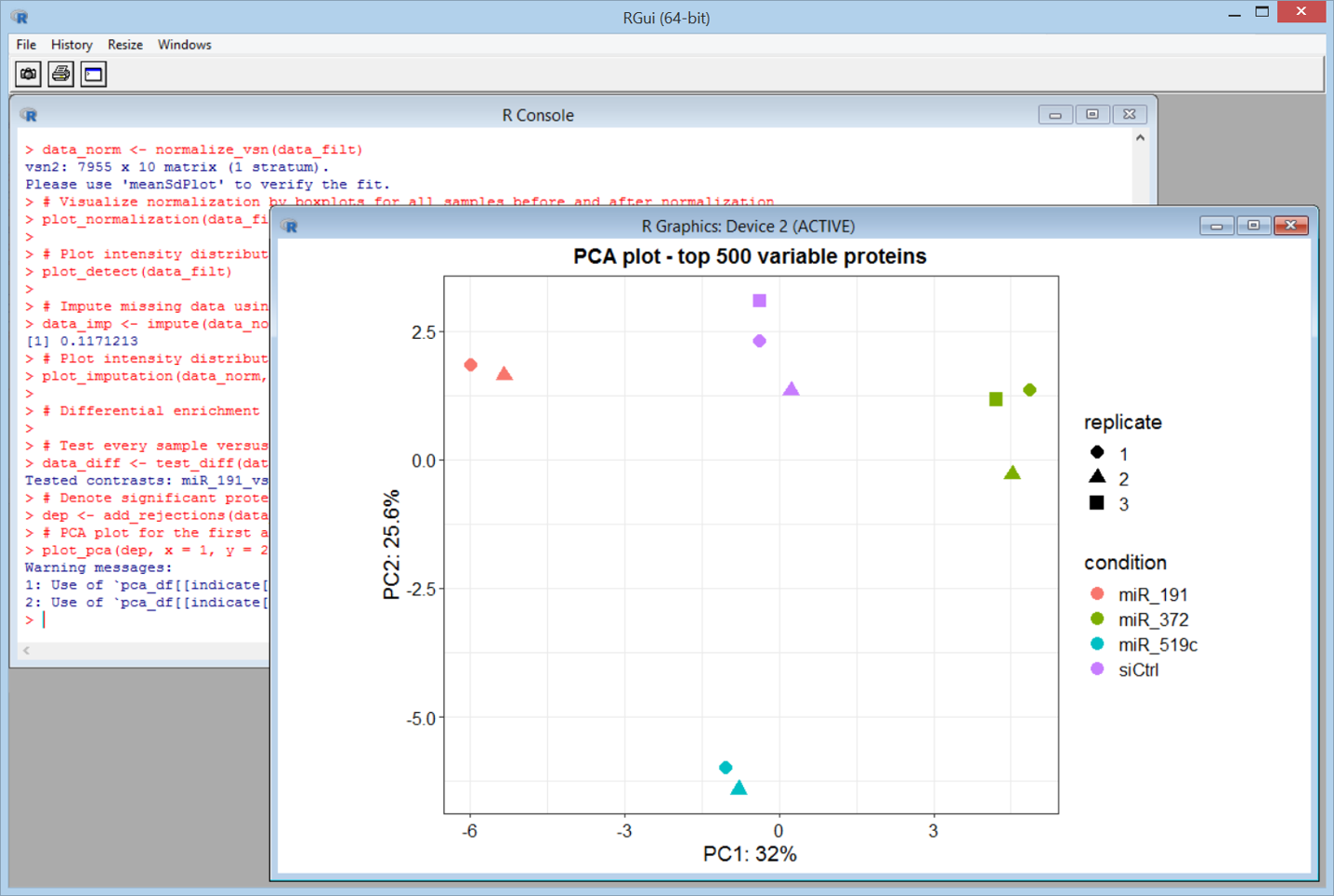
PCA shows the replicates cluster nicely.
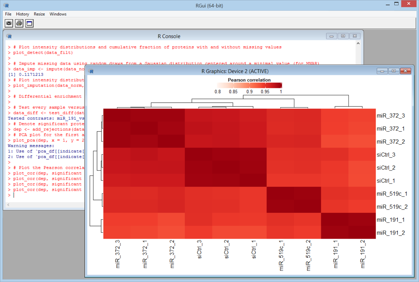
A heat map for sample to sample similarity.
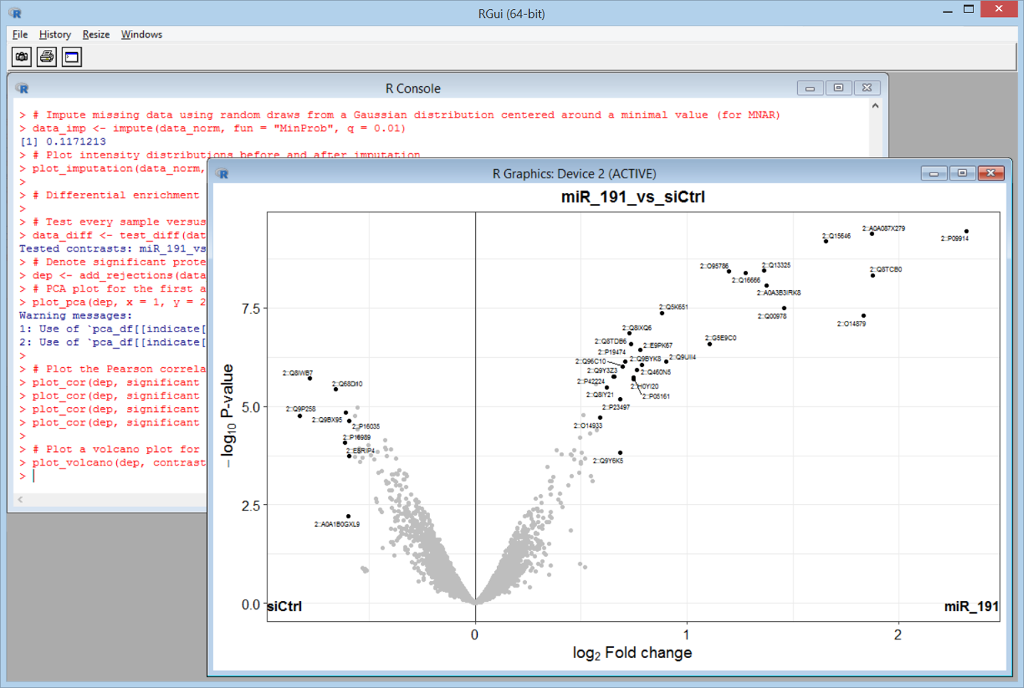
Finally, a volcano plot for fold changes between one treatment and the control. The outlier proteins are labelled with their identifiers.
As always, detailed help and reference material for the Sample Map and Quantitation Summary can be found in the Mascot Daemon help file. Bioconductor packages are mostly well documented and there is plenty of tutorial material for R on the web. The Quantitation Summary and the R commands used to create these plots can be downloaded here.
Keywords: export, Mascot Daemon, Mascot Distiller, quantitation, statistics, tutorial
Hi John,
Nice post! I looked at data in the quantitative summary file using a Jupyter notebook here: https://github.com/pwilmart/PXD004163_Notebooks/tree/master. Notebooks are nice for telling data analysis stories.
Cheers,
Phil