Reporting quantitation datasets with Mascot Distiller 2.8
In previous versions of Distiller, reporting of quantitation results was handled using XSLT transformation of the XML export of the quantitation results. XSLT is a powerful language, but it’s not commonly used, so writing custom reports could be an uphill stuggle. In Mascot Distiller 2.8, reports are written in Python and use Mascot Parser to access the search and quantitation results. Python is a commonly used programming language and using Mascot Parser provides simple access to both the search and quantitation results.
Versions of all the reports supplied with older versions of Mascot Distiller are available in Mascot Distiller 2.8. However, with the increased flexibility offered by using Python, we’ve added additional reports, including options to generate ANOVA, Box-Plot, various clustering reports and volcano plots, and a new option to export protein and peptide quantitation data in a format which can be easily imported into commonly used tools such as R and Perseus.
Please note that if you are running Distiller 2.8.2 or earlier, there are bugs present in three of the report scripts. Update to version 2.8.3 or later to fix these bugs.
Running Reports
Reports are run using a wizard interface, where you specify the parameters used to run the report. There are a number of common options on most reports – for example, you will often be given a choice of exporting any graphs in one of the following formats:
- Scalable Vector Graphics (.svg)
- Portable Network Graphics (.png)
- Interactive Javascript
The .svg and .png outputs are static images, but the interactive Javascript option uses the plotly library to enable interactive features such as zooming and tooltips. You can optionally export the graph into the Plotly web application to enable further editing and annotation, greatly simplifying the process of creating publication ready figures.
Several of the statistical reports, such as ANOVA, PCA and Hierarchical clustering, require that the proteins used have no missing values. These reports offer the following options for handling proteins with missing data:
- Delete proteins with missing data
- Enter a fixed value
- Impute missing values using K-Nearest Neighbours
If you choose to enter a fixed value or impute values using K-Nearest Neighbours, you’ll then be asked to set the maximum number of missing values to replace or impute – any proteins with more missing values than the specified limit will be removed from the report.
These types of reports also allow you to specify a contaminants database. Any protein matches identified from the selected database will be excluded from the report.
Custom reports
You can add custom reports to the system by writing your own Python reports. Reports are comprised of two files – an XML file which defines the wizard displayed in Mascot Distiller, and the Python script itself. Search and quantitation results are accessed using Mascot Parser, which is installed with the embedded copy of Python used by Distiller. To run the report, the python source and wizard XML files should be put in the C:\ProgramData\Matrix Science\Mascot Distiller\reports directory, and Mascot Distiller restarted.
If you have any existing custom XSLT reports, you can still use these from the command line by passing in the path to the XSLT template using the -quantreport switch. You can also run the new reports from the command line. See the Mascot Distiller help for more information about using Mascot Distiller on the command line.
Example LFQ dataset PXD026930
To demonstrate some of the new reports shipped with Mascot Distiller 2.8, we took a label-free quantitation dataset from the PRIDE repository. The dataset is from a publication that looks at the role of alanyl-tRNA synthetases in S. cerevisiae. Aminoacyl-tRNA synthetases are essential enzymes linked with neurological disorders in humans. The publication shows that the mutations have more general effects in yeast on the amino acid control pathway and heatshock response.
The experiment looked at three yeast strains, wild-type and two (C719A and G906D) which have mutations in alanyl-tRNA synthetases.
Cultures were grown at 30°C, sampled and then increased to 37°C for 2 hours before sampling again. The wild-type and G906D at 30°C were sampled 3 times, but C719A and G906D at 37°C were sampled only twice for a total of 15 analyses.
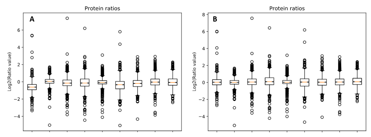
We reprocessed the raw data using Mascot Distiller, searched the generated peaklists with Mascot Server 2.8.1 using the search settings described in PRIDE, then carried out quantitation in Mascot Distiller. Ratios were taken for each mutant strain at each temperature against the equivalent wild-type sample, and the median protein ratio calculated. Because the same amount of protein was loaded for each sample, we’d expect the average protein ratio for each sample to be unchanged – that is a value of 1 when the ratio to wild type is calculated – so we enabled normalization using the median ratio. The effect of this can be seen by running the ‘Box plot’ report. Figure 1 below shows the box plots for protein ratios with and without normalization enabled.
Click to view full size image
Figure 1: Protein ratios plotted as a box plot with protein ratio normalization A) disabled and B) enabled.
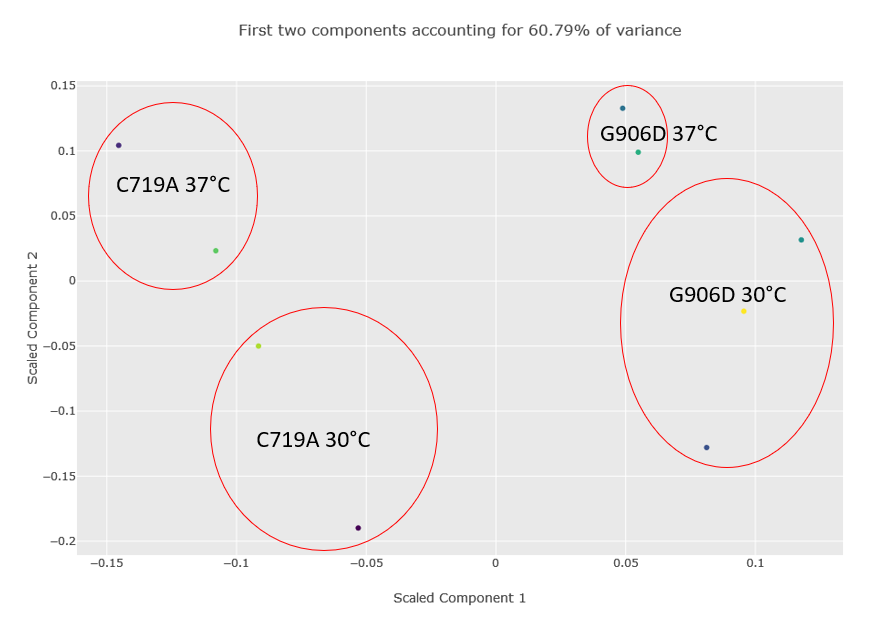
Figure 2 below shows the component plot from the PCA report. Contaminant database matches were excluded and K-Nearest Neighbour imputation for up to two missing values were specified when running the report. We can see from the component plot that component 1 clearly separates the C719A samples from the G906D samples. Component 2 separates most of the 30°C samples from the 37°C, with the exception of the G906D 30°C replicate 2 sample which has a positive value for component 2 while all the other 30°C samples have negative values.
Click to view full size image
Figure 2: Component plot from the PCA analysis. The image has been edited and the different groups and outlier G906D sample have been highlighted after the report was run.
To see a broader picture of proteins which define the different mutants and temperatures, we can try a report like the hierarchical clustering report. Unfortunately, with a dataset of this size, there are so many proteins essentially unchanged between the wild-type and mutant strains and different growth temperatures that you don’t see any meaningful grouping of proteins or samples in the generated dendrograms and heatmap.
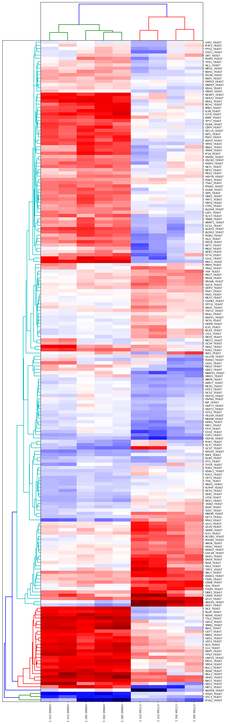
Another approach is to carry out an ANOVA test, which allows us to group the different samples into the separate groups (in this case, there are four groups comprised of the two different mutants at the two different growth temperatures). This allows us to identify proteins which are significantly different between and within the different groups. The output of the ANOVA can then be used to run a hierarchical clustering report if we select the “ANOVA plus clustering” report. The dendrograms and heatmap produced from this report are shown in Figure 3 below:
Click to view full size image
Figure 3: Output of ANOVA plus clustering report. Four groups were defined (G906D 30°C, G906D 37°C, C719A 30°C and C719A 37°C) and a significance threshold of 5% selected. Calculated p-values were corrected for multiple testing using the Benjamini-Hochberg procedure. Up to two missing values were imputed using K-Nearest Neighbours.
As you can see from Figure 3, the two mutants are strongly differentiated by several groups of proteins. For example, there are a number of differences in the responses of various metabolic pathways such as Alcohol dehydrogenase 3 which is strongly upregulated in G906D but strongly downregulated in C719A at both 30 and 37°C compared to wild-type.
Differences between the different growth temperatures for a single mutant type are also present. For example, there are clear differences between C719A grown at 30 and 37°C for proteins such as LHP1_YEAST, IF4F2_YEAST, PTH2_YEAST and CISY1_YEAST.
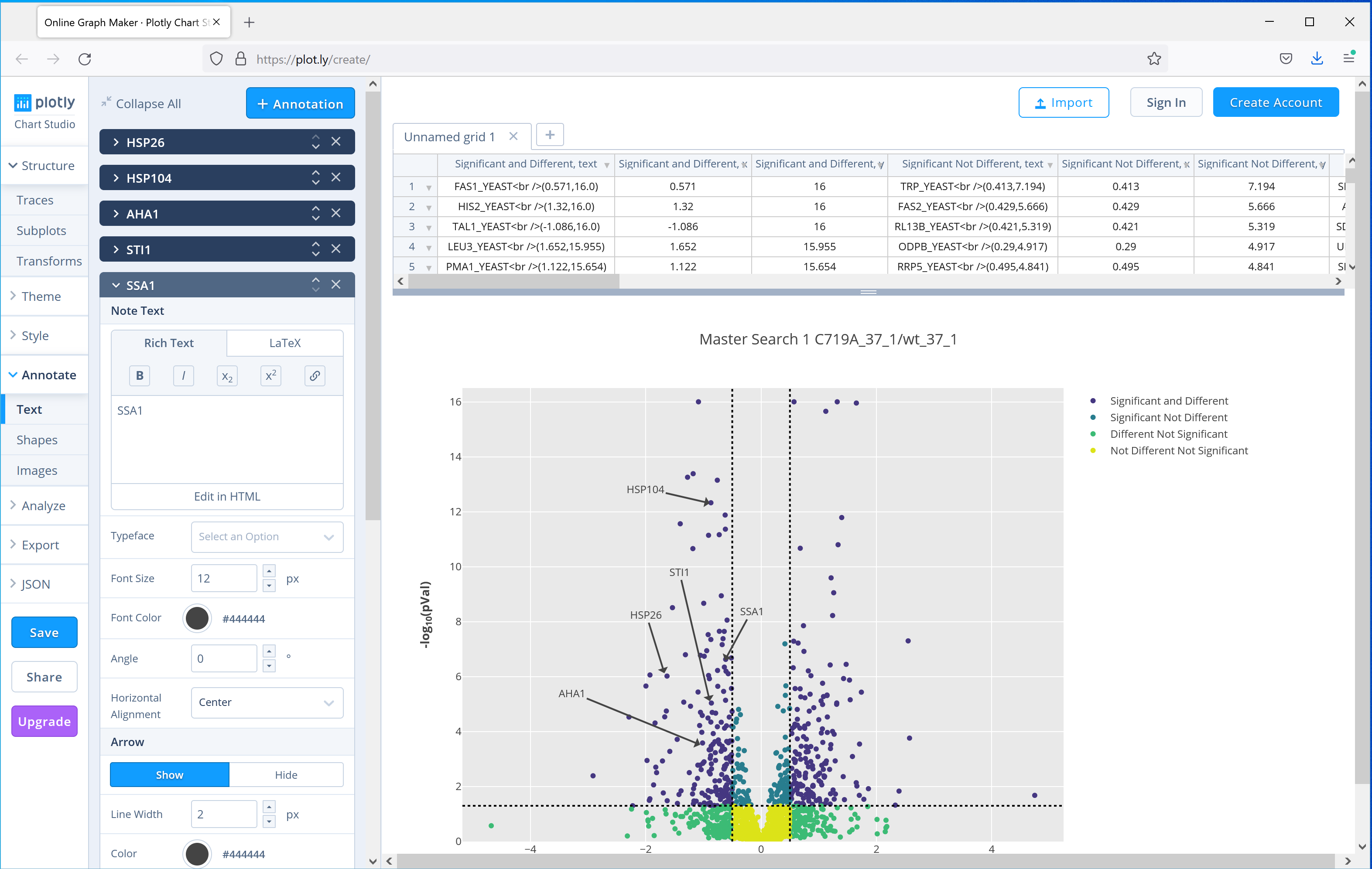
Distiller 2.8 ships with another commonly used plot, the volcano plot, which can be used to show significantly up or down regulated proteins. The paper uses a volcano plot of the results from the C719A mutant grown at 37°C compared to wild-type to highlight to highlight 5 proteins from the same pathway which were downregulated in the mutant. Figure 4 shows the equivalent plot generated by Mascot Distiller using the interactive Javascript option, which adds tooltips to each of the data points in the plot with the protein accession, and then selecting the option to open the plot in the third party plot.ly web application to further annotate the graph, showing how you can easily create publication ready figures using these tools:
Click to view full size image
Figure 4: Output of the Volcano plot report for one of the C719A mutants compared to wild type grown at 37°C, the plot then uploaded to the plot.ly web application for further annotation. Five proteins highlighted in the publication have been highlighted using the tools provided by plot.ly.
As you can see, the Python reports shipped with Mascot Distiller 2.8 offer a wide range of common analyses for quantitation datasets, simplifying the creation of publication ready figures. If you already have a licence for Mascot Distiller, then 2.8 is a free update. If not, and you’d to evaluate it, we offer a 30 day trial of Mascot Distiller. For details, please see the Mascot Distiller download page.
Keywords: Mascot Distiller, Python, quantitation, reporting, XSLT